Exact 1024 × 500 Canvas
Start directly in the Google Play feature graphic format so the composition is designed for the final store asset instead of being resized from another banner later.

Design the required Google Play feature graphic for your Android app or game with a clear central focal point, brand-led visuals, app or game imagery, editable messaging and high-quality export. Build a graphic that extends your store identity without simply repeating the app icon.
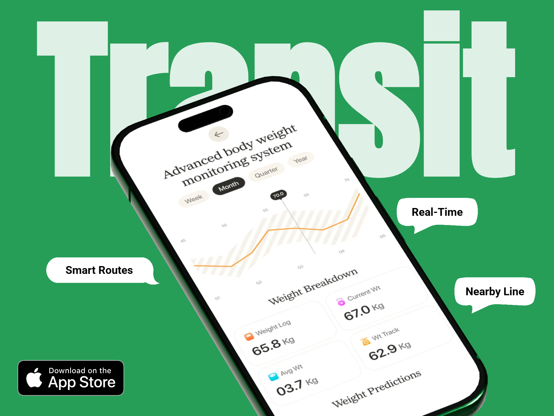
The feature graphic is not another screenshot and not a larger app icon. Use it as a broader branded visual that communicates the product experience while keeping the composition simple enough to survive smaller display sizes and cropping.
Start directly in the Google Play feature graphic format so the composition is designed for the final store asset instead of being resized from another banner later.
Keep the strongest product visual and key branding near the center so important content is less vulnerable to cropping on different Play surfaces.
Use product artwork, UI context or gameplay-inspired visuals that communicate what the app or game feels like rather than relying only on a logo.
Add a concise message only when it improves understanding. Keep the wording short enough to remain legible when the graphic appears at smaller sizes.
Extend the visual language of the app icon through typography, color and supporting imagery instead of placing an oversized duplicate of the icon in the feature graphic.
Export a crisp final image in a supported format for Play Console while keeping the original project direction reusable for future store updates.
Begin with the product experience and central focal point, then add only the supporting branding and copy the asset genuinely needs.
Decide whether the feature graphic should emphasize the app’s core benefit, gameplay, branded world, feature or launch theme.
Place the most important visual near the middle and keep edge content secondary so cropping does not remove critical information.
Use brand colors and short messaging that support the product rather than repeating the app icon or overcrowding the composition.
Check whether the focal point and message still work when reduced, then export the final 1024 × 500 asset in a supported file format.
Before uploading, check the asset as both a brand visual and a flexible Play Store graphic.
Google Play currently requires a feature graphic for publishing a Store Listing and provides detailed recommendations for composition, cropping and visual clarity.
Current Play Console guidance specifies:
Google recommends protecting the important content from variable presentation:
Google also recommends making the asset legible and distinct:
The same 1024 × 500 canvas can support very different visual strategies depending on whether you are presenting an app, mobile game, new release or branded product update.
Use a clean interface-led composition with a concise value message and a central product visual rather than a decorative logo-only banner.
Emphasize recognizable gameplay, characters, environments or action while keeping the most important visual information near the center.
Use a controlled brand palette, clear product context and minimal supporting copy that communicates trust and function without excessive detail.
Build around the user outcome, activity or product experience with enough contrast to keep the central story clear at reduced sizes.
Refresh the visual direction around a major update while keeping the broader app identity recognizable and aligned with the rest of the store listing.
Adapt any added messaging for the target language while preserving a centered focal point and the same overall visual identity.
These assets work together but serve different roles in the Google Play listing. The feature graphic is a broad branded composition, while screenshots demonstrate specific in-app experiences.
| Design Area | Feature Graphic | Store Screenshot |
|---|---|---|
| Main purpose | Brand-level app or game presentation | Demonstrate specific in-app experiences |
| Canvas | Fixed 1024 × 500 | Varies within Google Play screenshot rules |
| UI detail | Use selectively | Real UI should be prominent |
| Visual focal point | Keep important content near the center | Keep feature or workflow readable |
| Campaign role | Broad identity and promotional presentation | Feature sequence and product explanation |
Use this page for the dedicated feature graphic, then move to screenshots, listing coordination, templates or feature-graphic optimization when you need the next store asset.
Coordinate screenshots, feature graphics, localization and other Android listing assets in one connected workflow.
Build Google Play listing →Create the screenshot sequence around real Android app UI, feature messaging and current Play guidance.
Create Google Play screenshots →Create a feature graphic from a free-start workflow and export a clean standard marketing asset.
Create free feature graphic →Start from reusable 1024 × 500 compositions and customize the brand, app imagery, message and background.
Browse feature graphic templates →Explore different app and game presentation directions for inspiration before creating your own feature graphic.
View feature graphic examples →Review the current feature graphic dimensions, focal-point guidance, cropping considerations and content recommendations.
Read feature graphic guidelines →Common questions from Android developers and game creators preparing the required Google Play feature graphic.
A Google Play feature graphic is a dedicated 1024 × 500 store asset used to present an app or game visually across selected Google Play surfaces.
Yes. Current Play Console guidance states that a feature graphic must be provided to publish a Store Listing.
The current required size is 1024 × 500 pixels.
Current Google Play guidance requires JPEG or 24-bit PNG without alpha.
Google recommends keeping the prominent visual and focal point toward the center because outer areas can be cropped depending on the Play surface.
Google recommends avoiding prominent branding that simply duplicates the app icon. Use branding that extends the icon’s visual identity instead.
Yes, but keep it concise and protect important words from cutoff zones. Fine details and small text can become difficult to see on smaller displays.
Yes. The feature graphic can communicate app value, product context, gameplay, characters, brand identity or other experience-led visuals depending on the product.
RenderDuck is designed to provide clean standard app marketing exports without placing a RenderDuck watermark over the finished graphic.
Start with the correct 1024 × 500 canvas, build around a strong central focal point, customize the brand and message, and export a polished Google Play feature graphic directly from your browser.
Start Creating Feature Graphics