13-Inch iPad Layouts
Create App Store assets around Apple’s current required 13-inch iPad screenshot group.

Turn real iPadOS app screens into polished App Store product-page graphics with 13-inch iPad layouts, portrait or landscape presentation, split-view and multi-panel UI, localization support and high-quality export. Show what the app gains on a larger Apple display instead of enlarging an iPhone screenshot.
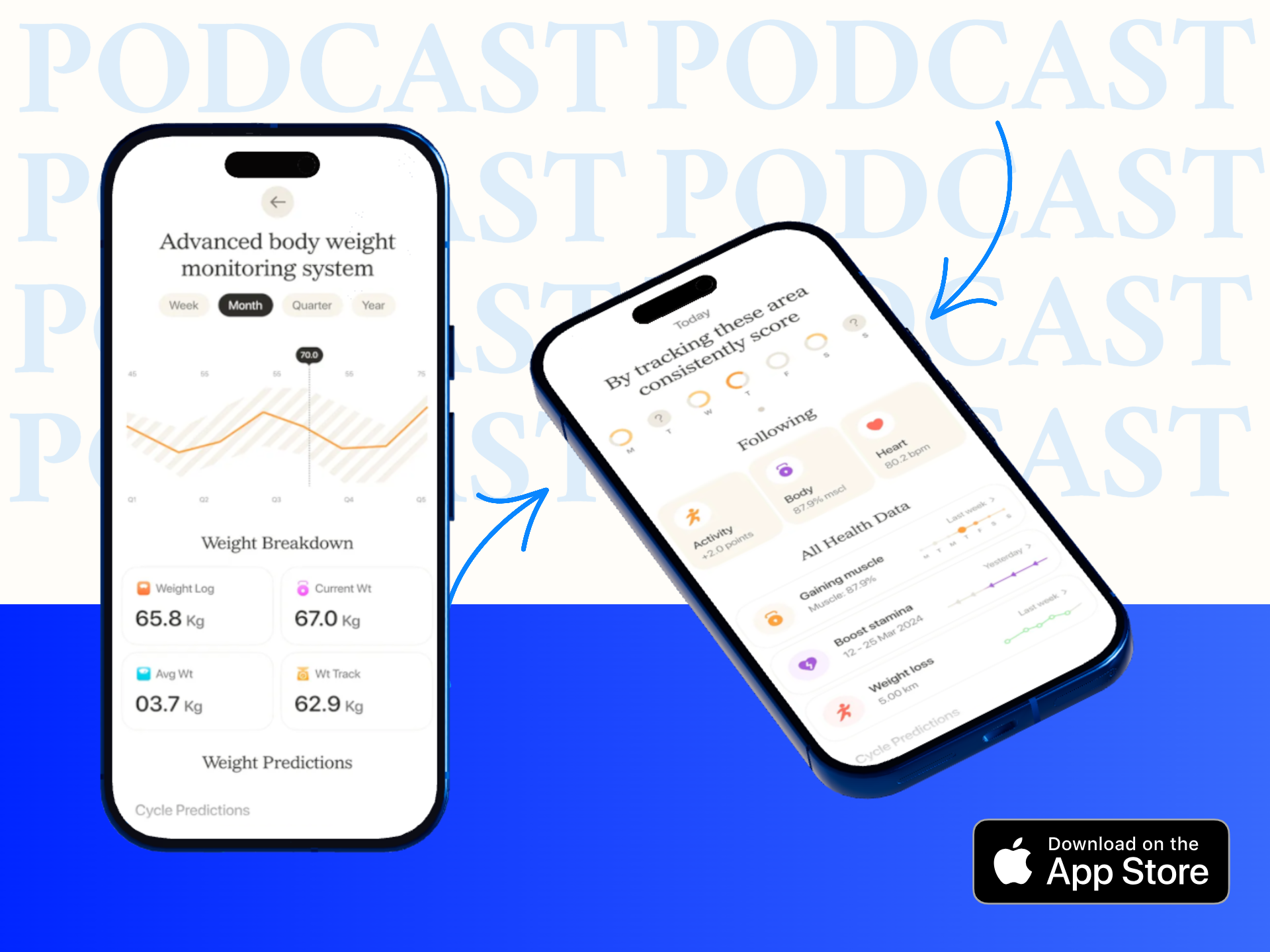
iPad screenshots should communicate the real large-screen product experience. Use the extra space to show navigation, split views, sidebars, creative workspaces, dashboards or content layouts that are difficult to demonstrate on iPhone.
Create App Store assets around Apple’s current required 13-inch iPad screenshot group.
Use vertical layouts for reading, productivity, note-taking and other iPad workflows that naturally work in portrait.
Use horizontal layouts for creative tools, dashboards, media, games and apps that benefit from wide iPadOS workspaces.
Show sidebars, split panes, inspector panels and wider information structures that make the iPad version genuinely different.
Add short supporting copy while leaving the iPad interface large enough to understand and inspect.
Adapt copy and app screens for each target language while preserving the large-screen design system.
Begin with genuine iPadOS captures, then build the store graphics around what the larger screen allows the product to do.
Use current iPadOS UI that shows large-screen navigation, wider workflows or other meaningful tablet behavior.
Match the screenshot orientation to how the app is actually used on iPad rather than copying the iPhone listing orientation.
Use concise feature copy, clean backgrounds and consistent spacing while keeping the iPad UI dominant.
Use an accepted App Store Connect resolution, localize where needed and let Apple scale down for smaller iPad groups when the UI is unchanged.
Apple currently treats the 13-inch iPad group as the required large-screen screenshot set when an app runs on iPad, with smaller iPad groups able to use scaled assets when the interface remains the same.
Current accepted screenshot examples include:
Apple’s current reference also includes 12.9-inch, 11-inch, 10.5-inch and 9.7-inch groups.
Current App Store Connect guidance states:
The iPad screenshot should make the large-screen advantage visible—whether that means more content, better navigation, a creative workspace or a wider product workflow.
Show sidebars, multi-column views, reports or project panels that make better use of iPad’s screen space.
Present lessons, reading material, navigation and learning controls together without compressing the experience into a phone-style frame.
Show canvas space, toolbars, layers, inspectors or editing panels that become meaningful on a larger iPad display.
Use the wider layout to show charts, tables, reports and management workflows that benefit from larger-screen density.
Use landscape presentation when browsing, playback or content discovery is naturally better on a wider screen.
Adapt copy and iPadOS screen content for each target language while preserving the same large-screen visual identity.
iPad screenshots should demonstrate the real tablet experience, especially when the app has different navigation, more visible content or multi-panel layouts.
| Design Area | iPad Screenshot | iPhone Screenshot |
|---|---|---|
| UI source | Real iPadOS interface | Real iPhone interface |
| Composition | Can show sidebars, split views and larger workspaces | Usually focuses on a compact mobile workflow |
| Required top group | 13-inch when the app runs on iPad | Use the applicable current iPhone group |
| Orientation | Landscape can be especially useful for wide workflows | Portrait is common, but landscape may fit games or media |
| Primary goal | Show the value of the larger Apple screen | Explain the core mobile app experience quickly |
Create complete iPhone and iPad product-page screenshot sets for App Store Connect.
Create App Store screenshots →Create iPhone and iPad screenshots for App Store, websites, launches and product marketing.
Create iOS screenshots →Create phone-specific App Store screenshots around current iPhone display groups.
Create iPhone screenshots →Place real iPad screens inside realistic device mockups for websites, launches and presentations.
Create iPad mockups →Review current 13-inch, 11-inch and other supported iPad screenshot groups and dimensions.
Check iPad screenshot sizes →Adapt iPad and iPhone screenshot copy and screen content for additional App Store languages.
Localize iOS screenshots →It helps turn real iPadOS app screens into polished App Store product-page graphics with device-specific dimensions, supporting copy, branding and localization.
If your app runs on iPad, Apple currently requires screenshots for the 13-inch iPad display group.
Apple currently accepts 2064 × 2752 and 2048 × 2732 pixels in portrait, with 2752 × 2064 and 2732 × 2048 pixels in landscape.
Apple currently allows one to ten screenshots for supported App Store screenshot groups.
Current App Store Connect guidance supports JPEG, JPG and PNG screenshots without alpha channels or transparency.
Not always. Apple can use scaled versions from the 13-inch group when accepted-size 11-inch screenshots are not separately provided and the user interface is the same.
Use genuine iPadOS captures when the tablet layout differs. Sidebars, split views, wider dashboards and other iPad-specific UI should be shown as they actually appear.
Yes. App Store Connect supports localized screenshots, and Media Manager can be used when you want specific assets for additional localizations or device sizes.
RenderDuck is designed to provide clean standard app marketing exports without placing a RenderDuck watermark over the finished graphic.
Add real iPadOS screens, choose portrait or landscape, highlight the large-screen experience, localize the copy and export polished 13-inch App Store screenshots directly from your browser.
Start Creating iPad Screenshots